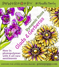
Hello Power Poppy friends!! Have you been enjoying the peeks? Have we enabled you yet? Well, we are sharing the stamp version of the Glads and Gerberas that were released as digitals in May. That's right, for those of you that like to ink up your images, you will now be able to have these two flowers, along with a variety of sentiments that fit perfectly with the flowers. The set is called: Dynamic Duo: Glads and Gerberas.
Now, I have two cards to share with you today, and there's a story behind just why also. In the one above, you will see primarily white Gerberas, with a hint of shadowing in the background, turquoise centers, and a charcoal gray stripe along the side.

For my second card, I colored the trio three different colors and added a aqua stripe to the side panel. Okay...have you ever battled with an image thinking it had you whipped?1?! Don't get me wrong...Gerberas are one of my favorite flowers, and Marcella has designed them beautifully. I made a card with them in May and thoroughly enjoyed coloring them. You can see that card HERE.
Well, I wanted to try my hand at a more modern graphic card with this trio, and it gave me fits. I literally colored this set 13 times, fussy cut the blooms 6 times, layered, burnished, added fun flock, stickles, rhinestone centers, and none of them fit with the look I wanted. I finally decided on solid colored petals. No shading what-so-ever. And then...would you believe I ended up with two that I liked and couldn't decide which one to use. First I couldn't make even one I was happy with, and now I have two. So, what's a stamper to do, but make 2.
I created the striped border using Copics that coordinated with the colors I used on the flowers. Each sentiment panel was colored with a Copic before stamping the sentiment onto it also. And lastly, the base panel was embossed with a polka-dot embossing folder (Cuttlebug).
So, there you have it...my struggle with these two cards. But it was worth it. I'm happy with the result, and now I have two cards.
Here's a list of the Bloom Brigade participants today. If you haven't visited their blogs yet, you, my friends, are missing out. These gals are uber inspirational!!
- Allison Cope
- Christine Okken
- Julie Koerber
- Katie Sims
- Tosha Leyendekker ---you are here
____________________________________________________________
Stamps: Dynamic Duo: Glads and Gerberas (Power Poppy)
Paper: White and Smokey Shadow (PTI), X-Press it Blending
Ink: Tuxedo Black (Memento)
Accessories: Copics, Long Classic Rectangles (Spellbinders), Dotted Embossing Folder (Cuttlebug), Sequins (Teresa Collins), Corner Rounder, Quickie Glue Pen, Glitter


Love the outcome Tosh, beautiful!
ReplyDeleteTalk about a dynamic duo! These two snappy cards are so much fun! How did you even come up with turquoise and charcoal for these - I love how you think outside the box every time!! I feel like having a scoop of Daiquiri Ice from Baskin Robbins with this card - it's ice, ice, baby beautiful!
ReplyDeleteOh girl...you are so persistent to try all those ideas...I bet every one of them was great....AND these are both fabulous...the graphic black and white with the soft turquoise is gorgeous. I’m glad you posted both of them too.
ReplyDeleteOh, these are gorgeous! I love the soft colors you've chosen, and I had to look twice to see they were different! Beautiful, and I LOVE this image! Stunning! Hugs!
ReplyDeleteI am cracking up Ms. Tosh -- I HAVE BEEN THERE when I stamped, cut, crinkled up, tossed, stamped again, tried to work it just so -- only to have something completely different take shape! These two cards are beauties and I think you got the graphically feel down perfectly! Love them both!
ReplyDeleteBoy, do I ever relate to your struggles! You were so dedicated to your vision, though, and I LOVE the outcome. The colors are fresh, yet there's a retro thing going on at the same time. VERY cool!!
ReplyDeleteTosh, I love this done in the limited color palette you chose.
ReplyDeleteWonderful job on the more graphic look using the gerbs! I love the monochromatic colors with the pop of aqua!!
ReplyDeleteBeautiful. I can't decide which one I like better either.
ReplyDeleteI adore the black and white with a hint of color. So pretty!
ReplyDeleteWOW!! Love the bold, dramatic look of this card! (Can't believe all the drama you went through to create this, but it sure made you create an amazing card!)
ReplyDeleteBeautiful color palette. Will save this to CAS.
ReplyDeleteDon't you just hate it when you have such a trouble with figuring out what you want to do, they end results is pretty, my fav is the first card!
ReplyDeleteLove the graphic feel of these two cards Tosh! So bright and bold! Love the splash color - especially the teal! Incredible creations my friend!
ReplyDelete